Active Cultures
Scope — Creative Direction, UX/UI, Site Redesign
Designed at — The Stable (acquired by Accenture Song)
Collaborators — Sarah Johnson, Daniel Lurvey
Site Launch — November 2023
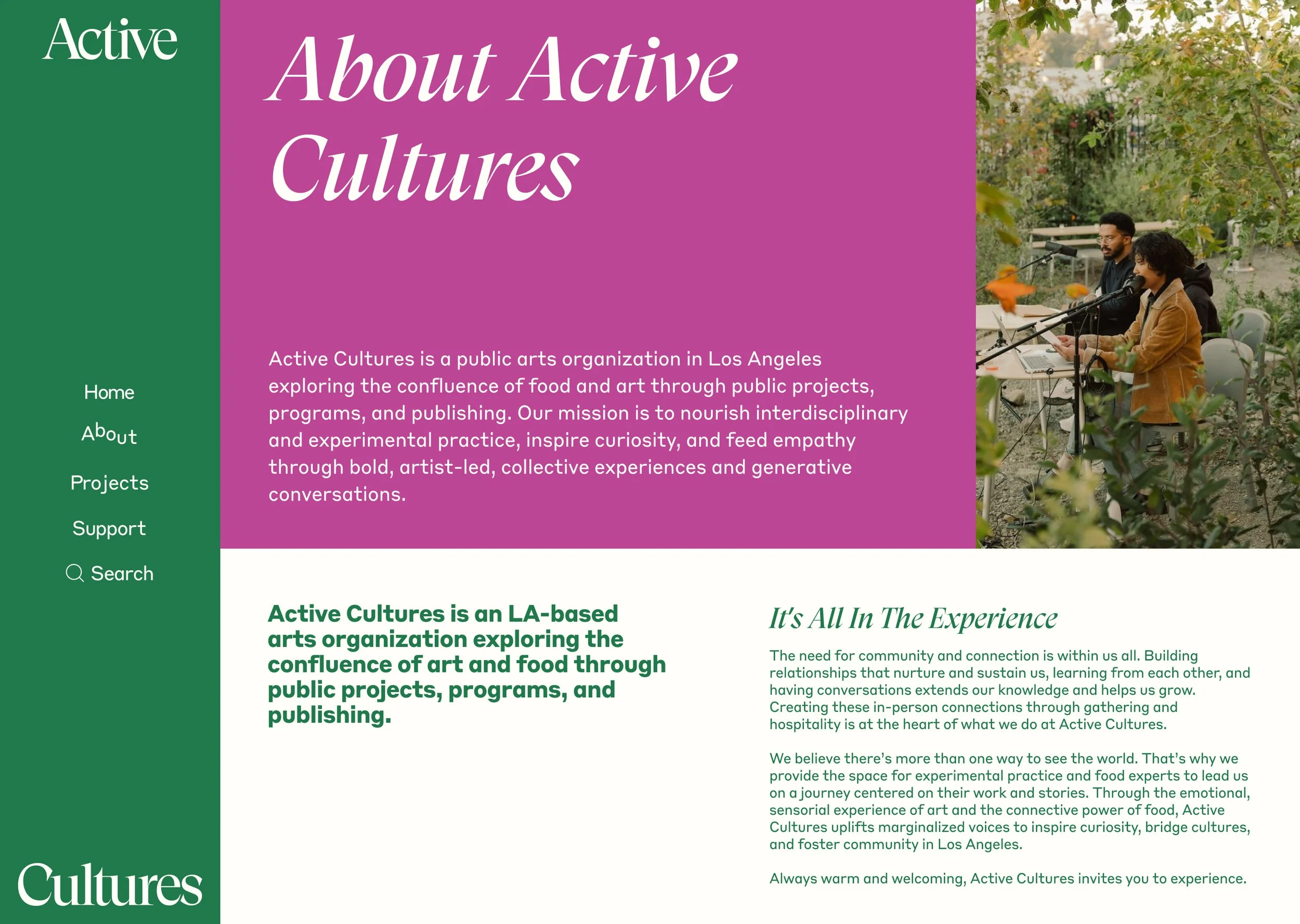
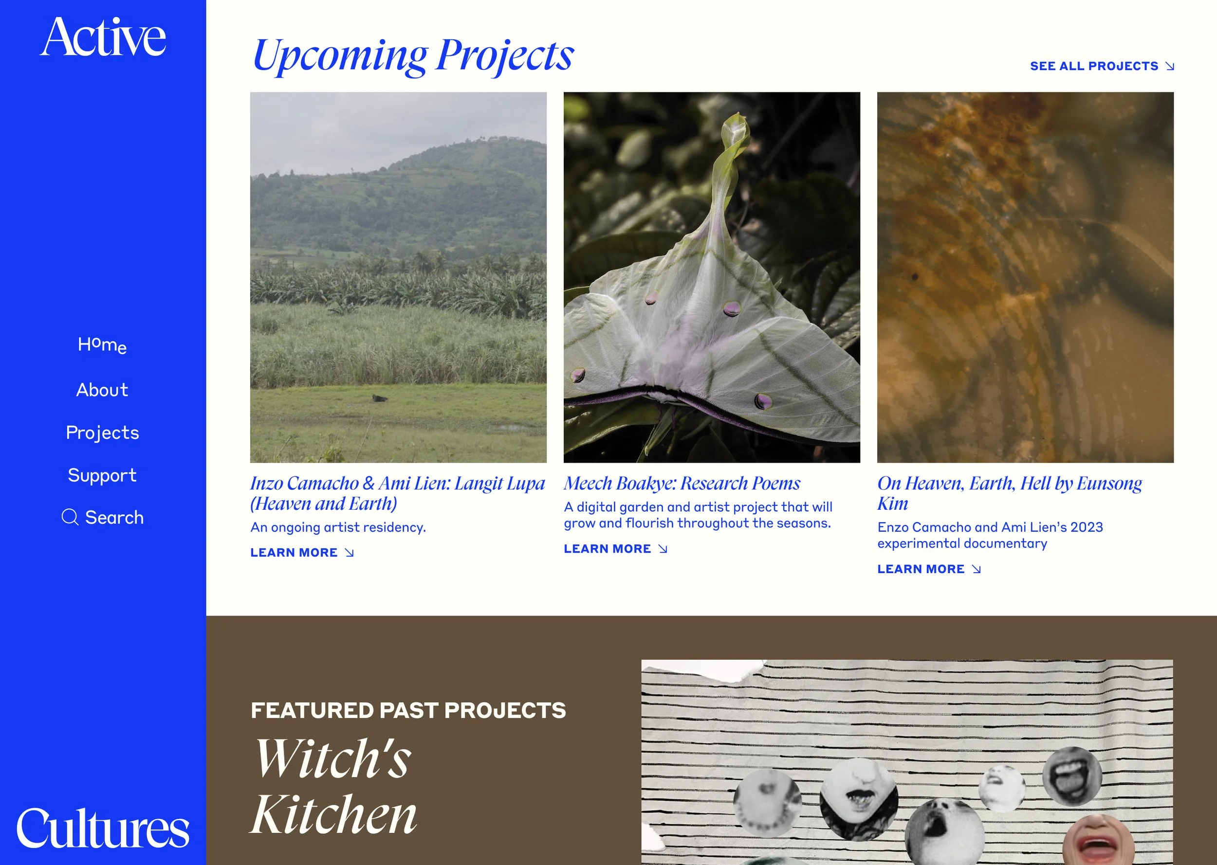
Active Cultures is a Los Angeles-based public arts organization exploring the intersection of food, art, and culture through public projects, programs, and publishing.
As part of a broader brand refresh, I helped redesign the digital experience to reflect the organization's vibrant visual identity and art-forward perspective while creating a more accessible and engaging platform for its community.
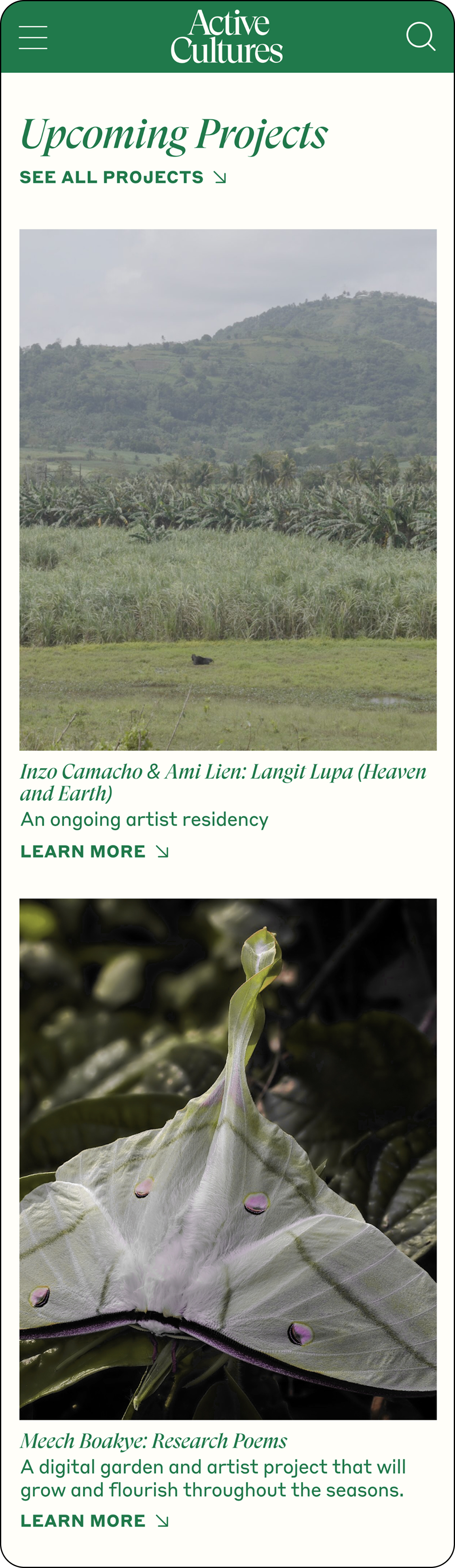
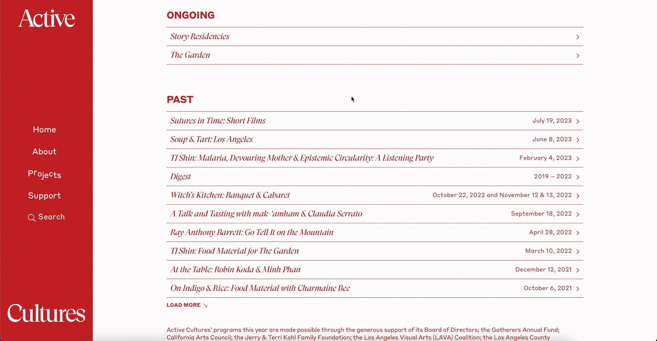
Visual Design
Built around a flexible editorial framework, the visual identity uses expressive color, typography, and imagery to reflect Active Cultures' vibrant and community-driven mission. Dynamic layouts create moments of energy and discovery, while a structured system ensures consistency across the organization's diverse programs, publications, and events.
The result is a bold yet welcoming visual language that balances artistic expression with accessibility, inviting audiences to explore, participate, and connect.
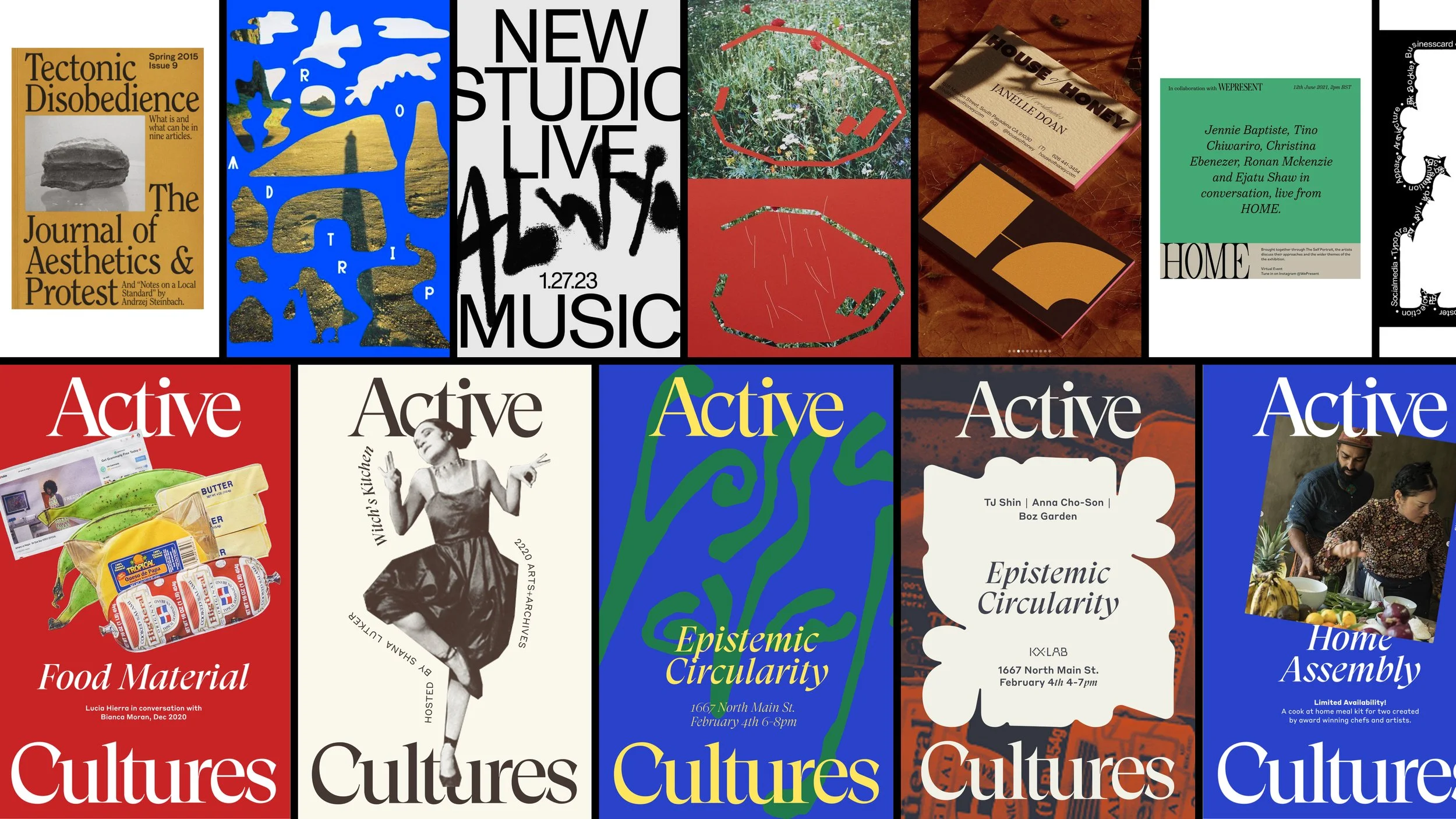
Creative Direction Exploration
The creative direction exploration developed by our studio team was rooted in the defining aspects of Active Cultures: fostering meaningful connection through gathering and creating space for artistic experimentation. These principles informed a visual language that paired artistry and eccentric energy with bold, expressive moments.
Drawing from contemporary arts institutions, independent publishing, and cultural programming, the exploration established the foundation for the broader brand system. My role was to translate these creative principles into a cohesive digital experience, ensuring the website reflected the same spirit of openness, curiosity, and community while remaining accessible and intuitive to navigate.

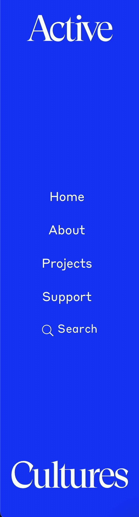
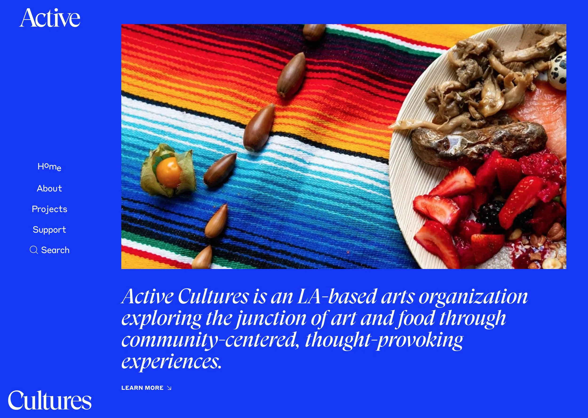
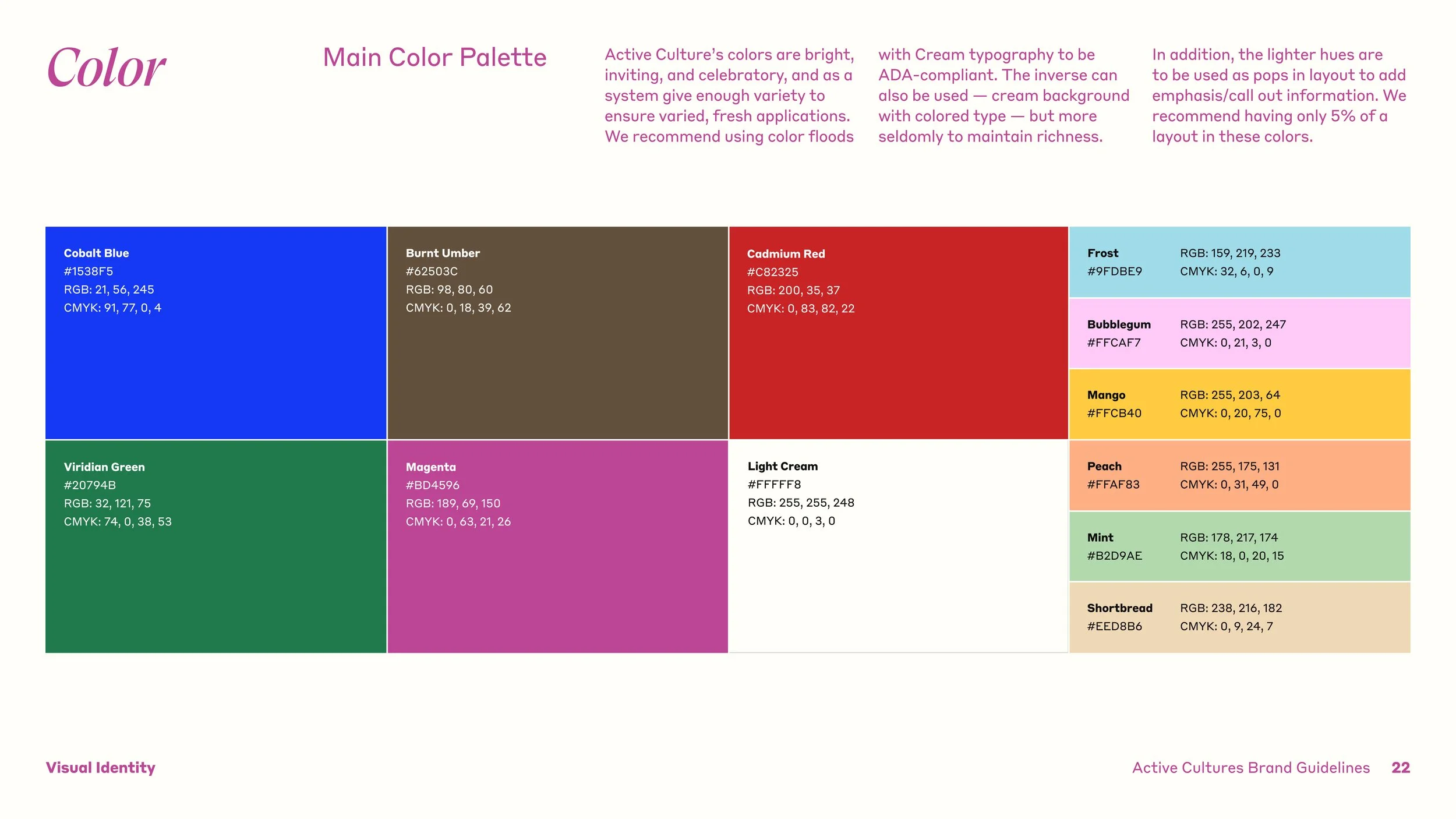
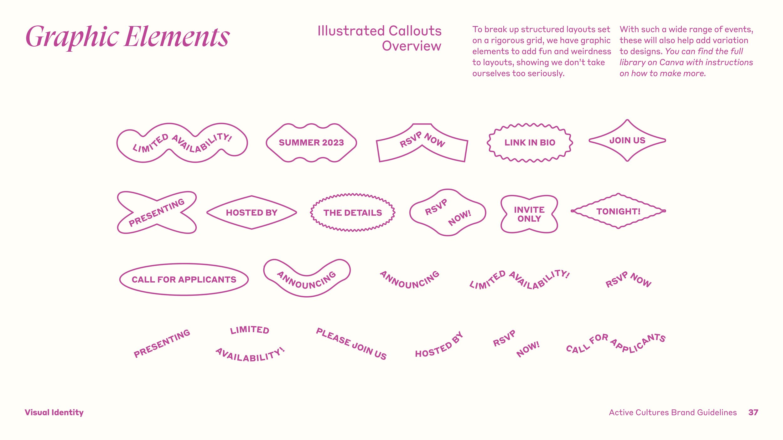
Color “Randomizing” Feature
To reinforce Active Cultures' spirit of experimentation, I designed a dynamic color framework that introduced moments of surprise throughout the digital experience. As users navigated the site, color palettes could shift and evolve, creating a sense of discovery that reflected the organization's artistic and exploratory nature.
Behind the scenes, the system was governed by a curated set of accessible color pairings, ensuring each combination maintained sufficient contrast and usability while preserving the playful unpredictability of the experience.